How to Create Responsive Sections
You can decorate your website very beautifully with Elementor. This involves creating responsive sections for your homepage and layouts that adapt perfectly to different screen sizes, ensuring a consistent user experience across all devices. Below are the step-by-step guidelines:
1. Create a New Responsive Section
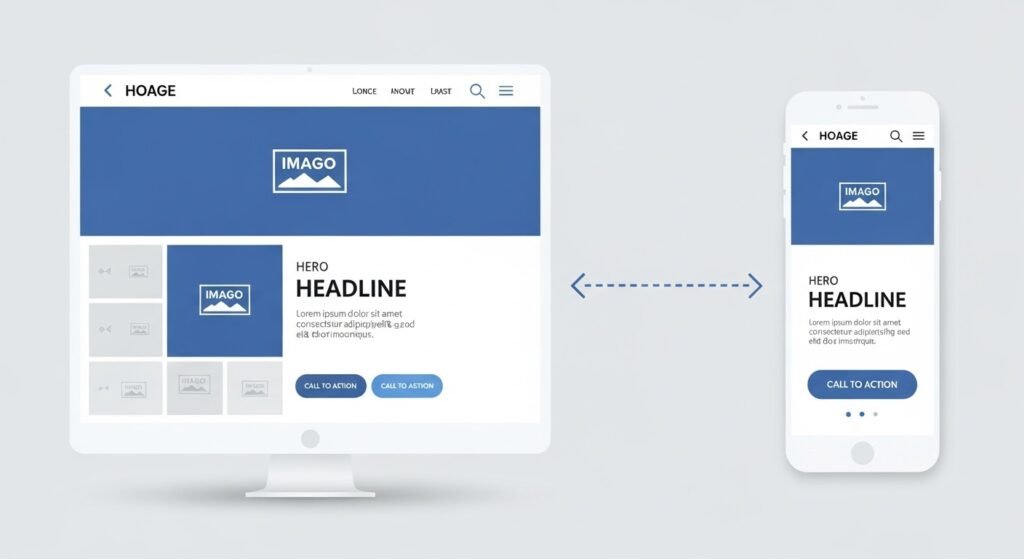
Add a new section using Elementor by choosing the appropriate signature structure for your design, from single and multi-column layouts.
This new section acts as a workable container, so you can bring in devices like text, images, and buttons, as well as customize the design and layout of your site to your liking.
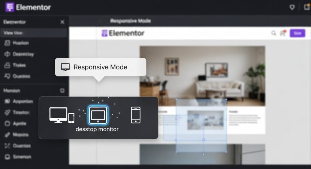
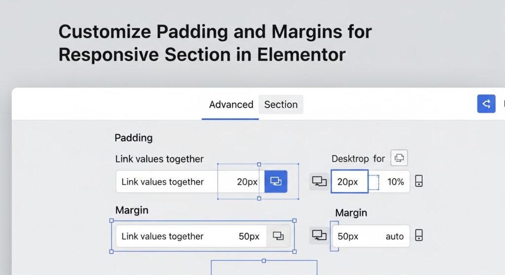
Use Elementor’s accessible Mode to preview and adjust your design for desktop, tablet, and mobile devices. You can strongly match elements like font sizes, padding, and margins to confirm everything looks perfect on smaller screens. Optimize images for faster load times and hide or show sections based on the device. Finally, test your section on real devices to ensure a flawless, responsive experience.
2. Adjust Column Widths for Devices
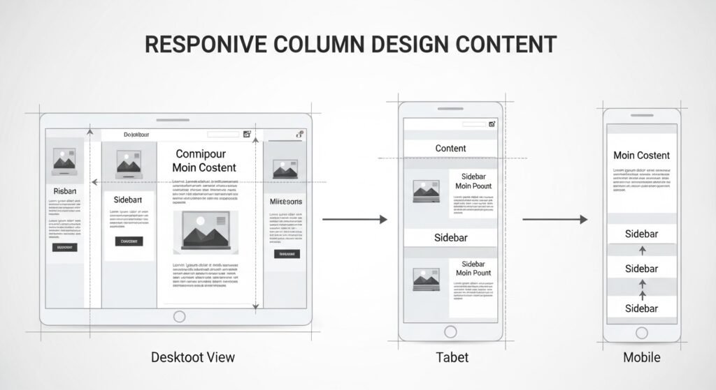
By adjusting column widths for devices in Elementor, you can adjust your WordPress website layout to display well on all screen sizes, including desktops, tablets, and mobile phones. Elementor offers responsive controls that allow you to change the width of each column specifically for different devices. For example, you can set wider columns for desktop views and adjust them to stack vertically or have narrower widths on mobile devices.
3. Enable Responsive Mode
4. Customize Padding and Margins for Responsive Section
5. Set Visibility Options
Elementor improves website user experience by setting visibility through elements, allowing control of what content is displayed on different devices. This feature lets you hide specific sections, columns, or widgets on the device you’re using, showing what you need on the device you don’t need.
For example, you can display a large image on a desktop but hide it on mobile devices to avoid cluttering the screen. By setting component view values, you can display your content objects to suit the unique needs of each device. Make sure your website is clear, relevant, and easy to navigate for all users.
6. Optimize the Text Size of the Responsive Section
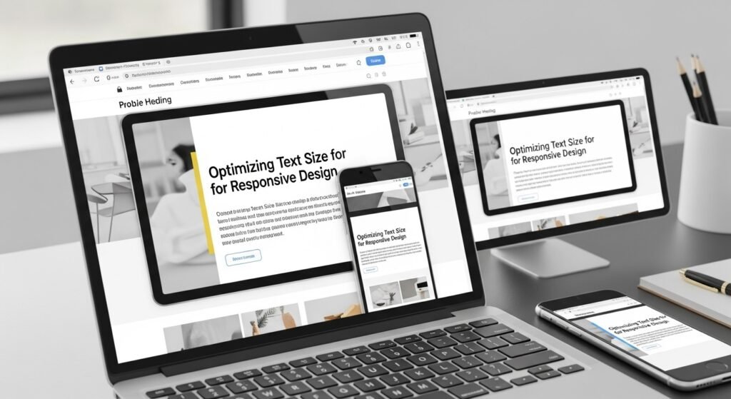
In a WordPress Website text size optimization is an essential aspect of the website. Optimizing is a good practice for creating a user-friendly design. By suitably adjusting text size, designers can ensure that the design remains understandable across all devices. Not only does this help keep users engaged, but it also minimizes the challenge to the eye and enhances the overall user experience. In addition, optimizing text size is critical for convenience, as it enables content to be easily acquired by everyone with low vision or those using screen readers.
Good practices for optimizing website text size include using relative units like EMs or percentages, preferably specific units like PX, and ensuring proper line height to increase readability. Maintaining a strong contrast between the background and text. CSS frameworks can help adjust text size, period, and ease of access. Checking tools can ensure consent with accessibility excellence. Finally, optimizing text size is about creating a user-friendly, modern environment where content is convenient to all.
7. Use Flexible Units
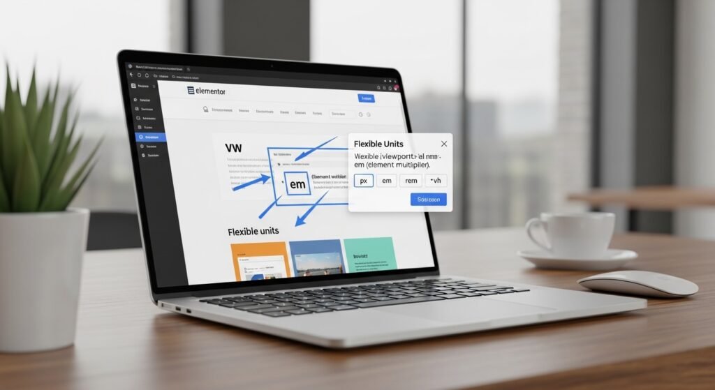
Utilizing flexible units in Elementor is an essential technique for crafting a responsive and adaptable WordPress website design. Unlike fixed units like pixels (px), flexible units such as percentages (%), viewport width (vw), and viewport height (vh) allow your design elements to scale according to the screen size for instance, setting a column’s width in percentages ensures it adjusts proportionally across different devices, while vw and vh units allow elements to occupy a specific portion of the screen, independent of device resolution.. Using flexible units ensures that your layout stays fluid and consistent, delivering a seamless user experience across all screen sizes.
8. Test Across Devices

All of Elementor’s device tests are necessary to ensure that your website displays and functions on various screen sizes, including desktops, tablets, and smartphones. If you have access to the wrong page, use the active mode of the element to visualize the shape, but your site will be displayed on different devices. You can use it to identify and correct space problems, the waste of the text, or the alignment of elements survenir sur les petits écrans. Also, it is important to test the equipment to ensure that the impregnation performance is prepared for real conditions. With functional testing for all devices, you can deliver a consistent experience and enjoyment for all visitors.
9. Apply Custom CSS for Further Tweaks
Using custom CSS in Elementor allows you to make advanced design tweaks that go beyond the built-in styling options. This helps refine specific elements, add unique styles, or achieve a particular appearance that the default settings do not provide. You can target individual sections, columns, or widgets by adding custom CSS directly within Elementor’s settings or using the WordPress customizer. This flexibility lets you adjust details like hover effects, precise spacing, or custom fonts, ensuring your website’s design is perfectly aligned with your vision. Custom CSS is especially valuable for creating a more personalized and polished user experience.
10. Save and Publish
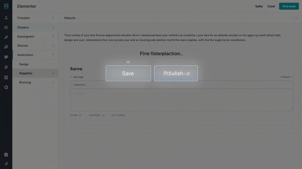
Save and publish is the last step in Elementor when you’re done designing or updating your WordPress website. Saving your changes ensures that all your updates are saved and not lost, allowing you to pick up again where you left off later if needed in the future. When you’re ready to make your update go live, publish your design updates to the site. So that all visitors can visit the latest version of your website design.
Elementor allows you to preview your design before publishing, so you can review how it looks across different devices. Once you’re satisfied, clicking the “Publish” button makes your new content or design changes visible to your audience, completing the process of building or updating your site.
In conclusion, creating a responsive homepage section with Elementor is a crucial step in ensuring your website looks professional and functions seamlessly across all devices. By planning your layout, utilizing Elementor responsive tools, adjusting settings for different screen sizes, and optimizing your design, you can deliver an excellent user experience on desktop, tablet, and mobile.
Thanks for reading our article.
Developer at WPCarePoint
Booking for 30m Free Consultation on Google Meet: Click here for an appointment today.
contact@wpcarepoint.com
www.wpcarepoint.com

