Struggling with mobile navigation? Build a responsive WordPress Menu in 4 easy steps. Optimize your site now with WPCarePoint.

4 Easy Steps to Creating Mobile-Ready Responsive WordPress Menu
In WordPress, one of the most popular content management systems, creating a responsive menu is both critical and relatively simple. This essay will guide you through the process of creating a mobile-ready, responsive WordPress menu, covering essential considerations, using WordPress’s built-in features, integrating plugins, and applying custom CSS for more advanced customization.
Perceive the importance of responsive menus
User experience and mobile traffic
The importance of responsive menus cannot be overstated. With the majority of global web traffic coming from mobile devices, ensuring that your website is accessible and easy to navigate on smartphones and tablets is most important. A responsive menu that adjusts its layout and design based on the user’s screen size is a key component of a positive mobile experience. If a menu is not responsive, users on smaller screens may struggle to find content, leading to frustration and potentially higher bounce rates.
SEO contemplations
Search engines like Google prioritize mobile-friendly websites in their rankings, especially with the introduction of mobile-first indexing. A responsive menu contributes to the overall mobile-friendliness of your site, which in turn can improve your search engine rankings. This makes the creation of a responsive menu not just a design priority but also a crucial aspect of your site’s SEO strategy.
Menu Structure Plan

Before creating a menu structure, you should plan properly. It’s essential to plan your menu structure carefully before diving into the technical aspects of creating a responsive menu. A well-organized menu allows users to find what they’re searching for quickly and efficiently.
What is Primary and Secondary Menu:
Primary Menu:
This is the main navigation menu that appears notably at the top of your site. It should include links to Home, About, Services, Blog, and Contact; those arethe most important sections of your website.
Secondary Menu:
Depending on your site’s complexity, you may also want a secondary menu. This could include less critical pages, such as legal disclaimers, privacy policies, or login/register links.
Categorize Content:
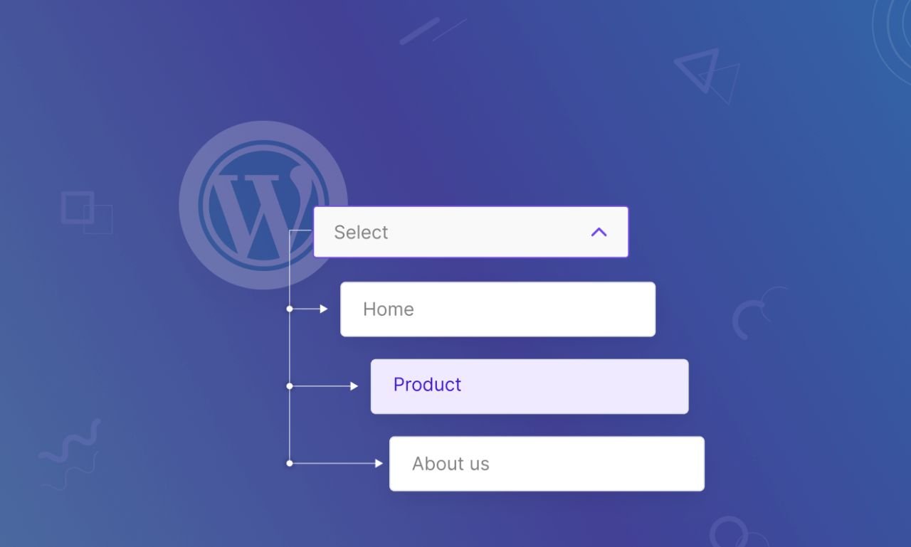
- Group similar pages under appropriate categories. For example, under “Services,” you could have a dropdown menu with different service offerings. This categorization helps in creating a more intuitive and user-friendly menu.
Keep It Simple:
- Avoid overcrowding the menu with too many links. Simplicity is key to a clean, easy-to-navigate menu, particularly on mobile devices where screen space is limited.
Creating a Responsive Menu Using WordPress’s Built-in Features
WordPress offers robust built-in features for creating responsive menus, making it accessible even for those with limited technical skills.
Step1: Using the WordPress Customizer
The WordPress Customizer is an intuitive tool that allows you to create and manage your site’s menus in a live preview mode.
Step-by-Step Guide:
Access the Customizer:
-
- In the WordPress dashboard, navigate to “Appearance” > “Customize.”
Create a New Menu:
-
-
- Click on “Menus” and then “Create New Menu.”
- Name your menu (e.g., “Primary Menu”) and choose its location (Primary, Secondary, or a custom location depending on your theme).
-
Add Menu Items:
-
- Click “Add Items” to start adding pages, posts, categories, or custom links to your menu.
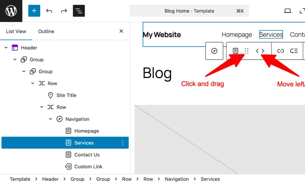
- You can reorder the items by dragging and dropping them.
- To create a dropdown menu, drag a menu item slightly to the right beneath its parent item.
Enable Responsive Features:
-
- Most modern WordPress themes are responsive by default, meaning the menu will automatically adapt to different screen sizes. However, it’s essential to test the menu on various devices to ensure it functions as expected.
- The Customizer allows you to preview your site on desktop, tablet, and mobile screens. Use this feature to check how your menu looks and adjust accordingly.
Publish the Menu:
-
- Once you’re satisfied with your menu, click “Publish” to make it live.
Step2: Using the Menu Editor in WordPress
The WordPress Menu Editor offers a more detailed interface for creating and managing menus.
Step-by-Step Guide:
Access the Menu Editor:
-
- Navigate to “Appearance” > “Menus” in the WordPress dashboard.
Create a New Menu:
-
- Click “Create a new menu,” name it, and set it as your Primary Menu or another location depending on your theme.
Add and Organize Menu Items:
-
- Add pages, categories, or custom links to your menu. You can organize items into dropdowns by dragging them slightly to the right beneath their parent item.
Set Menu Display Location:
-
- Choose where the menu will appear on your site by selecting the appropriate display location, such as Primary Menu or Mobile Menu.
Save the Menu:
-
- After organizing your menu items, click “Save Menu.”
Step3: Enhancing the Menu with Plugins
While WordPress’s built-in tools are powerful, plugins can extend their functionality, offering more advanced features and customization options for your responsive menu.
1. WP Mobile Menu
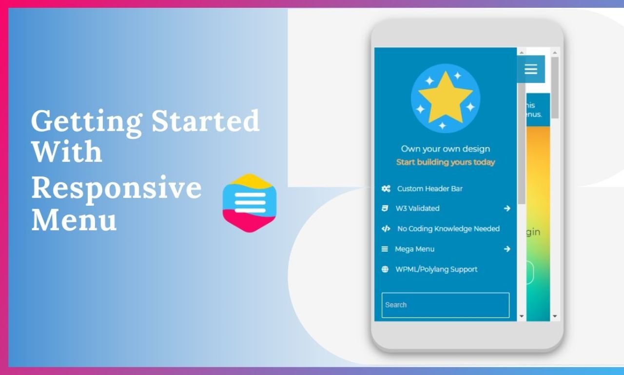
WP Mobile Menu is a popular plugin that focuses specifically on creating mobile-friendly menus. It provides a highly customizable, mobile-first menu solution with features like slide-out menus, icons, and more.
Key Features:
- Touch-Optimized Menus: WP Mobile Menu ensures that your menu is easy to use on touchscreen devices, with features like swipe gestures and smooth transitions.
- Customizable Design: You can fully customize the look and feel of your mobile menu, including colors, fonts, and menu behavior.
- Multiple Menu Layers: The plugin supports up to three menu levels, allowing you to create complex, nested menus if needed.
- Logo and Branding: Add your logo or branding to the mobile menu for a consistent brand experience.
Step-by-Step Guide:
Install and Activate WP Mobile Menu:
-
- Go to “Plugins” > “Add New” in the WordPress dashboard.
- Search for “WP Mobile Menu,” install, and activate the plugin.
Configure Menu Settings:
-
- Navigate to “WP Mobile Menu” in the dashboard menu.
- Here, you can configure the look and feel of your mobile menu, including menu layers, animations, and visibility options.
Assign Menu Items:
-
- The plugin allows you to choose which menus to display on mobile devices. Select the appropriate menu you’ve created earlier.
- You can also create a mobile-specific menu if needed.
Customize Design:
-
- Use the plugin’s design settings to customize colors, fonts, and other visual elements of your mobile menu.
Test and Adjust:
-
- Preview your mobile menu on various devices and make adjustments as necessary.
2. Max Mega Menu
Max Mega Menu is another powerful plugin that enhances WordPress menus by allowing you to create mega menus with rich content, including images, widgets, and more.
Key Features:
- Mega Menu Support: Create large, multi-column dropdown menus that can include images, icons, and widgets.
- Responsive and Touch-Friendly: The plugin is designed to work seamlessly on mobile devices, ensuring a smooth user experience.
- Customizable Layouts: You can fully customize the layout and style of your menus, including the use of custom CSS.
- Accessibility Features: Max Mega Menu includes features like keyboard navigation support, making your menu more accessible.
Step-by-Step Guide:
Install and Activate Max Mega Menu:
-
- Go to “Plugins” > “Add New” in the WordPress dashboard.
- Search for “Max Mega Menu,” install, and activate the plugin.
Enable Mega Menu:
-
- After activation, go to “Appearance” > “Menus.”
- You’ll notice a new “Max Mega Menu Settings” tab in the menu editor. Enable the mega menu for the desired menu.
Configure Mega Menu Items:
-
- Click on any menu item to configure its mega menu settings. You can add widgets, icons, and custom layouts to your dropdowns.
Customize Design:
-
- Navigate to “Mega Menu” > “Menu Themes” in the WordPress dashboard.
- Here, you can customize the appearance of your mega menu, including colors, fonts, and dropdown behavior.
Test Responsiveness:
-
- Test your mega menu on various devices to ensure it works smoothly across different screen sizes.
Step4: Customizing Menus with CSS
For those with a bit of coding knowledge, custom CSS offers endless possibilities for tweaking the appearance and behavior of your responsive menu. This can be particularly useful for achieving a unique design that matches your brand’s aesthetic.
Targeting Mobile Screens with Media Queries
Media queries in CSS allow you to apply specific styles based on the user’s device screen size. This is essential for creating a responsive menu that looks and functions well on mobile devices.
Example:
css
/* Mobile menu styles */

@media only screen and (max-width: 768px) {

.main-menu {

display: none; /* Hide the default menu */

}

.mobile-menu {

display: block; /* Show the mobile menu */

}

.mobile-menu ul {

list-style: none;

padding: 0;

}

.mobile-menu ul li {

padding: 10px;

border-bottom: 1px solid #ccc;

}

}
In this example, the main menu is hidden on screens smaller than 768px wide, and a mobile-friendly menu is displayed instead. You can customize these styles further to match your site’s design.
Styling Dropdown Menus

Dropdown menus can be particularly tricky on mobile devices. Using CSS, you can create touch-friendly dropdowns that are easy to navigate.
Example:
css
/* Dropdown menu styles */

.main-menu ul li:hover > ul {

display: block;

position: absolute;

background-color: #fff;

z-index: 1000;

}display: none;
position: absolute;
top: 100%;
left: 0;
width: 200px;
background-color: #fff;
box-shadow: 0 2px 10px rgba(0, 0, 0, 0.1);
}.main-menu ul li ul li {
padding: 10px;
border-bottom: 1px solid #eee;
}.main-menu ul li ul li: hover {
background-color: #f0f0f0;
}
This CSS ensures that dropdown menus are easy to access and visually distinct, improving the user experience on both desktop and mobile devices.
Creating a mobile-ready, responsive WordPress menu is an essential step in providing a seamless user experience across all devices. With the growing importance of mobile traffic, a well-designed responsive menu not only enhances user satisfaction but also contributes to better SEO performance. By following the steps outlined in this guide, you can create a responsive menu that not only looks great but also enhances the overall functionality and accessibility of your WordPress website. In the ever-evolving digital landscape, ensuring your site is mobile-friendly is not just an option—it’s a necessity.
Thanks for reading our article.
Developer at WPCarePoint
Booking for a 30-minute Free Consultation on Google Meet: Click here for an appointment today.
contact@wpcarepoint.com
www.wpcarepoint.com
